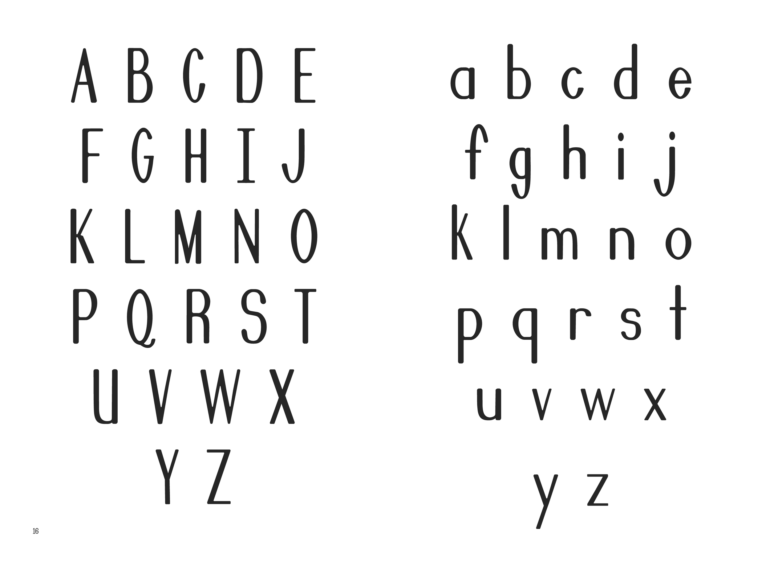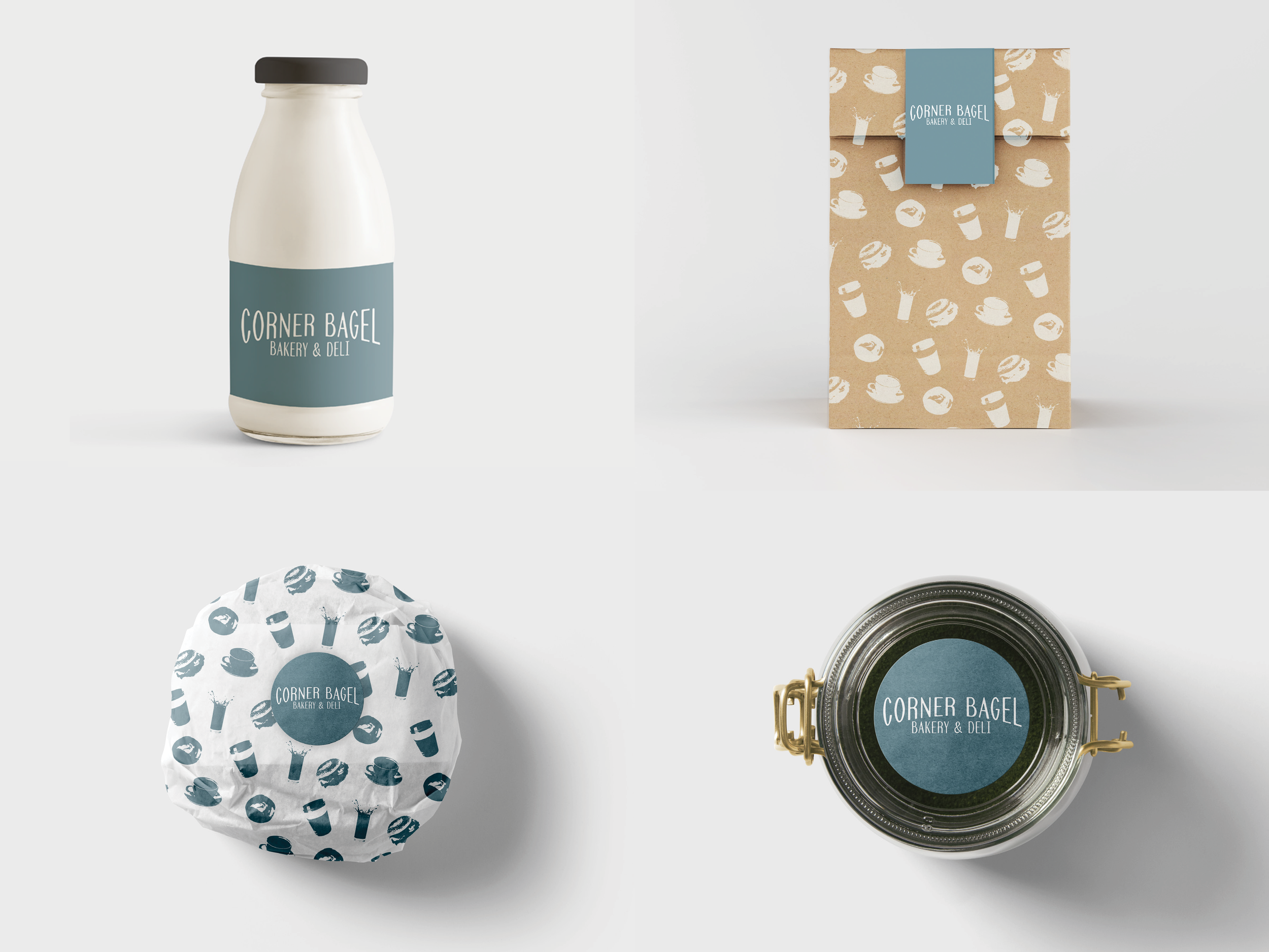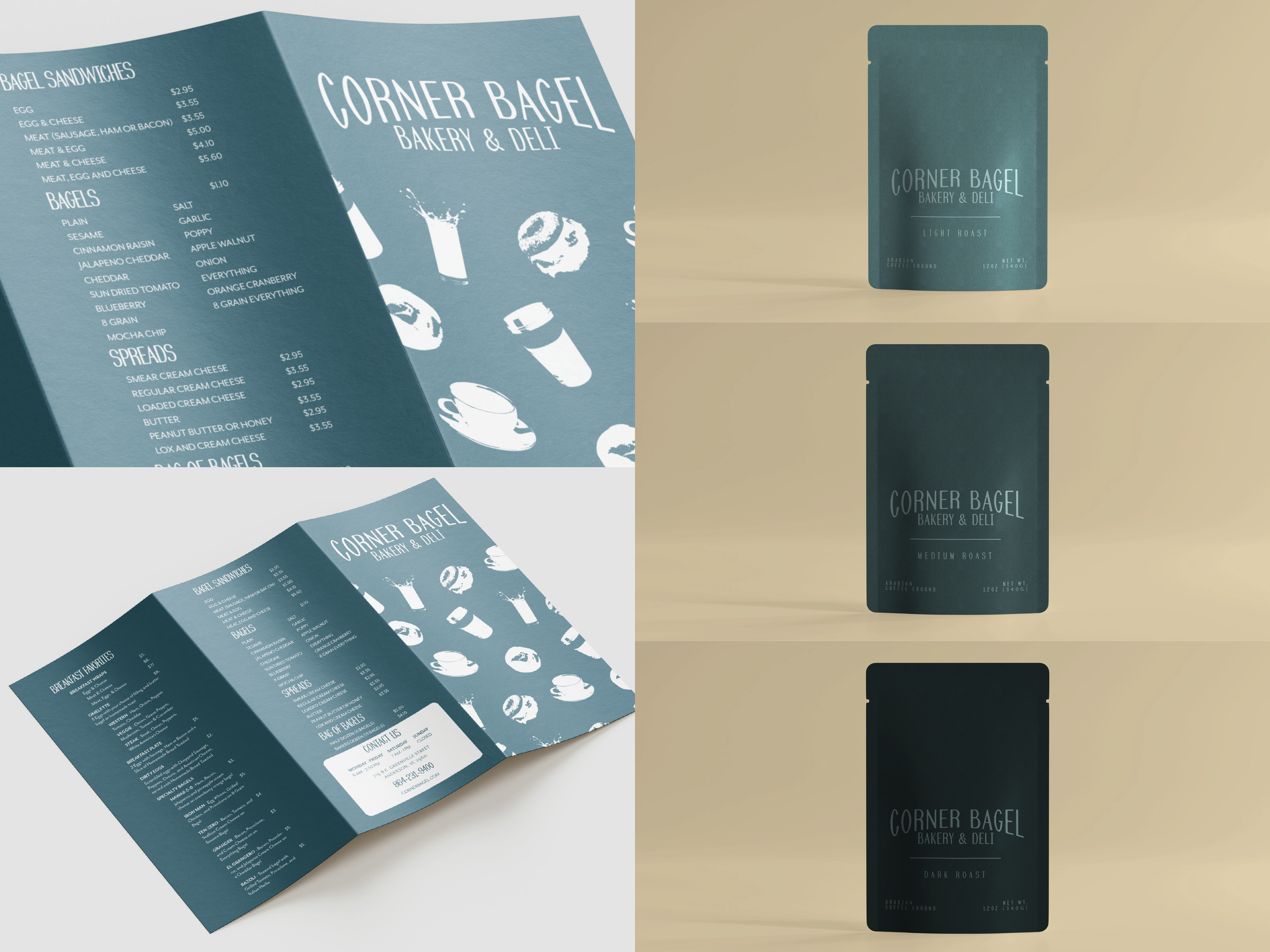


Sourdough is a typeface designed for Corner Bagel that is meant to feel warm, consistent, and packed. Sourdough was created out of a need for consistency in typefaces used in wordmarks and their brand while still showcasing the comforting atmosphere within this loved local bakery and deli.
After researching and looking into their branding, it was clear that there was room for improvement, both in making the branding feel consistent with the surroundings and creating a typeface that would allow for the feeling of closeness connected with Corner Bagel.
The inspiration for this typeface came from the people and place itself, pulling from the environment and the interactions of the people who visit this establishment. Warmth, consistency, and compactness all played a major part in the beginning sketches making taller letters, slightly rounded edges, and differentiating weight between the strokes. The final letterforms were inspired by the differentiating weight of the typeface Didot. Sourdough was created to be taller, more condensed, and with rounded edges.
Sourdough contained four styles, regular, oblique, bold and extra bold. Multiple styles allowed for strong legibility and hierarchy when using the typeface.
Project Type
Typography, Exhibition, Publication
Collaboration
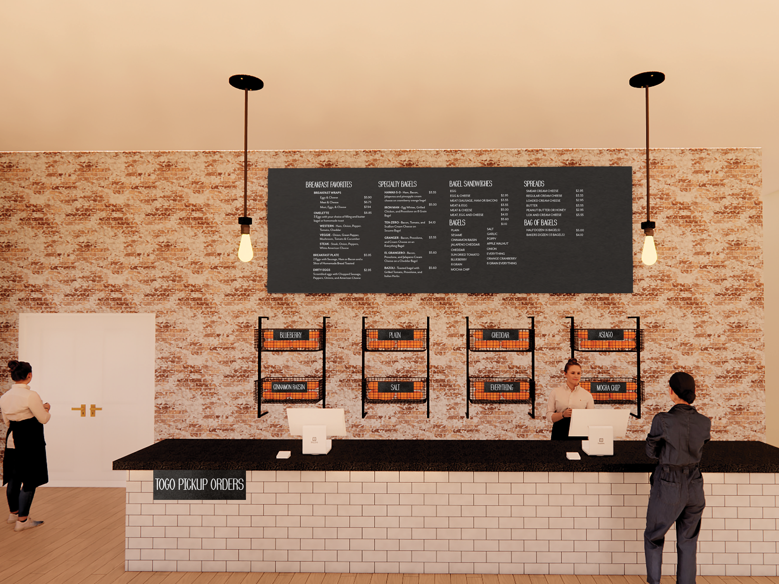
Worked with Interior Designer, Samantha Childers, to use these designs in a rendered space and worked with the AU Type Foundry to create an installation design for the AU 2022 Typography Exhibition named “26 Characters.”
Deliverables
Research, Exhibition Design, Typography